Catering
Turning old into new – a fresh design for morning grouches
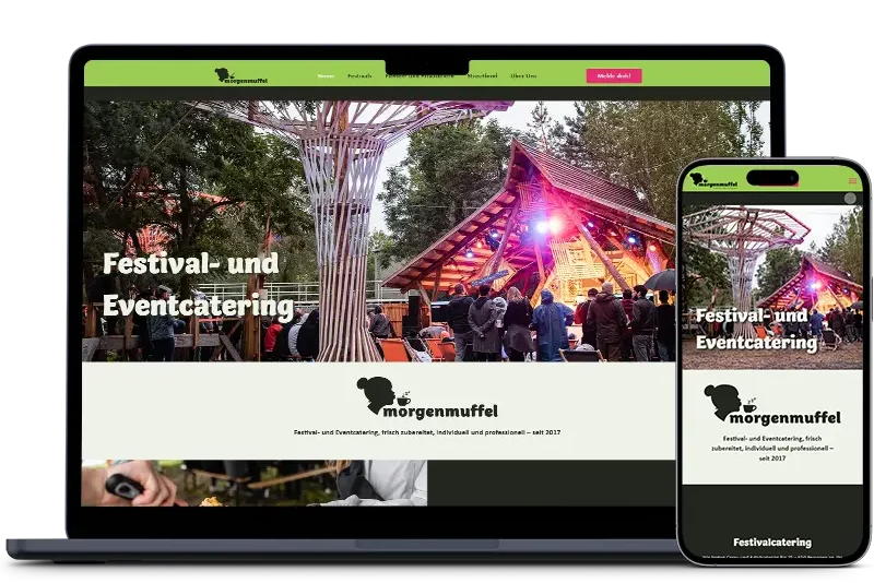
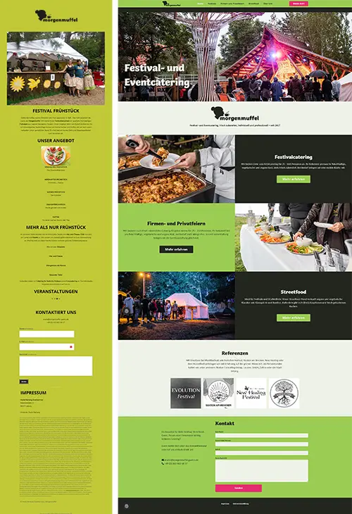
We have designed a really tasty website for Morgenmuffel Gastro. The Leipzig-based catering company asked us to give its old website a complete new look.

New colors, better appetite
First order of business: a new color scheme. We replaced the old yellow-green that had served as background for the entire page with a fresh lime green. Based on this shade of green, we defined an off-white and an off-black, i.e. a light and a dark shade that is perceived as white and black, respectively, when viewing the web page under normal conditions. In reality, however, the two shades are highly desaturated and brightened or darkened variants of that same lime green. Off-whites and off-blacks make for a more eye-friendly viewing experience, as the contrast effect of white and black is still present, but not quite as pronounced. Thus, the off-white and off-black serve as the main colors in Morgenmuffel’s new design. The lime green was used as a secondary color. Finally, a bright raspberry pink set the necessary accent to clearly show users what Morgenmuffel wants them to do: “Get in touch!”

Loads of Space for photos
In contrast to the very dense old design, the fantastic pictures by photographer Vampkitty were given large amounts of space, so that visitors to the site immediately start to get an appetite, and the Morgenmuffel team was presented in an absolutely professional manner. This ultimately also gave the texts more room to breathe.
Content conception & web design: rnm

